
The SuperSonics haven’t played an NBA game since 2008, yet Seattle’s defunct team still looms large in basketball’s cultural landscape. In local sports bars, the familiar green and gold remains ever-present. The name resurfaces in league expansion debates, and the jerseys still sell nearly two decades on. So, what makes this defunct franchise and its identity so enduring? Let’s take a closer look.
The origin of a sonic identity
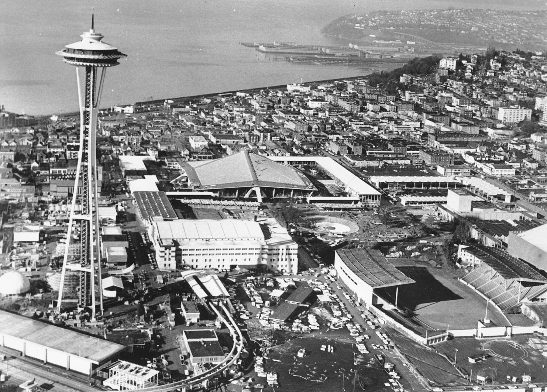
Founded in 1967, the SuperSonics emerged during a wave of tech-fueled optimism. With Boeing as a major force in Seattle, the team’s name paid homage to the futuristic promise of supersonic air travel. From the beginning, the identity reflected an ambitious regional pride and a forward-looking, innovation-driven spirit.


Evolutionary logo design
The SuperSonics brandmark has undergone six major evolutions, with the 20-year stretch from 1975 to 1995 delivering the most enduring and recognisable identity.
Seattle’s inaugural team logo featured the Space Needle and a supersonic jet. Both instantly rooting the brand in the techno-futurist spirit of the 1960s. A brief detour followed, with a generic basketball emblem that lasted just one season.

In 1971, a new ’70s swagger arrived. Gold took hold, and the typeface captured the playful, tripped-out energy of the era. By 1975, the skyline logo debuted with a design that would define the team for two decades. It remains the Sonics’ most iconic emblem, and one of the cleanest identities in NBA history. For many, Seattle’s skyline is "best seen through that green and gold basketball."

In the mid to late ’90s, designers leaned heavily into computer-aided design, sparking a wave of highly illustrated, maximalist logos. While that era now carries a nostalgic, kitschy charm, many of the brand marks lack the boldness and clarity of their predecessors. The Sonics’ final logo was a nod back to their most iconic look — but with less personality. It begs the question: why not stay truer to the original 1975 brandmark?

The power of green and gold
Colour psychology plays a huge role in branding. The bold 1970’s inspired clash of deep green and yellow-gold still stands out in a league dominated by reds and blues. The palette carries an air of retro cool and is distinctly connected to the forest-laden Pacific Northwest.


In the late ’90s, the team briefly abandoned its roots in favor of a confused palette of dark green, burnt red, and bronze. You could say it was “of the era”. Thankfully that era passed, and Seattle returned to the strength of the original scheme. Green and gold endured.


The move, the loss, and the rise of nostalgia
In 2008, the Sonics controversially relocated to became the Oklahoma City Thunder. While OKC got the players, Seattle kept the soul. Sonics jerseys became symbols of joy. The team’s absence only deepened the brand’s meaning, shifting its identity to represent a golden era in Seattle. Nostalgia branding in its purest form.


Where are we now?
The push to bring back the Seattle SuperSonics hasn’t let up. NBA expansion rumours swirl every few years, and if the day comes, we hope Seattle will be ready. Ready to embrace the green, white and gold, the skyline logo, and everything the Sonics stood for.
Because some brands don’t fade. They just wait for the comeback.


